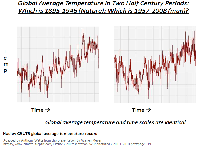
Source: When somebody hits you with that new “IPCC is 95% certain” talking point on global warming, show them this.
by Anthony Watts, with h/t to Burt Rutan &
Warren Meyer; graph by Warren Meyer
(slide 49 in this presentation).
WUWT, August 20, 2013.
In the half-century covered by the 1895–1946 graph CO2 rose by only 15 ppmv (5.3%). In the half-century covered by the 1957–2008 graph CO2 rose by 70 ppmv (22.5%), i.e., a 4.2× greater CO2 forcing.
“Control knob?”
I do not doubt that rising CO2 level contributed to warming, but the similarity of the two graphs, despite the huge dissimilarity of the two CO2-forcings, obviously doesn't support the case for CO2 being the “principal control knob”[2] for climate.
The “control knob” wasn't methane, either. In the half-century covered by the 1895–1946 graph methane (CH4) rose by 0.25 ppmv (29%), and in the half-century covered by the 1957–2008 graph CH4 rose by 0.57 ppmv (47%).
Here's a follow-up article:
https://wattsupwiththat.com/2018/04/20/where-exactly-is-the-problem/
You can easily reproduce these two graphs (very closely) at any web site which can produce graphs of HADCRUT3 temperatures, e.g., WoodForTrees.org. It doesn't “work as well” with other temperature indexes.
HADCRUT4 shows less 1895-1946 warming.
BEST shows more more 1957-2008 warming.
GISTEMP does both of those things. (When climate alarmists show only GISTEMP to "prove" their points, the're cherry-picking the temperature index which shows what they want to show.)
The differences between the various temperature indexes prove that we really don't know what the global temperature record looks like.
In fact, the uncertainty is even worse than you'd guess from that comparison, because those temperature indices are mostly based on the same measurement data, which has a lot of problems.
The Earth's average temperature is remarkably stable. The temperature differences we're talking about are tiny:
mere
fractions of a degree, temperature changes which are dwarfed by diurnal and seasonal changes. Thus far there's scant
evidence that the small changes in globally averaged temperature caused by anthropogenic GHG emissions are harmful.
SeaLevel.info
