Global temperatures, 1960 to 2014
These two large graphs of “global” temperatures from 1960 to 2014 were produced by the “Interactive Graph Generator” on Paul Clark's “
Wood For Trees”
web site.
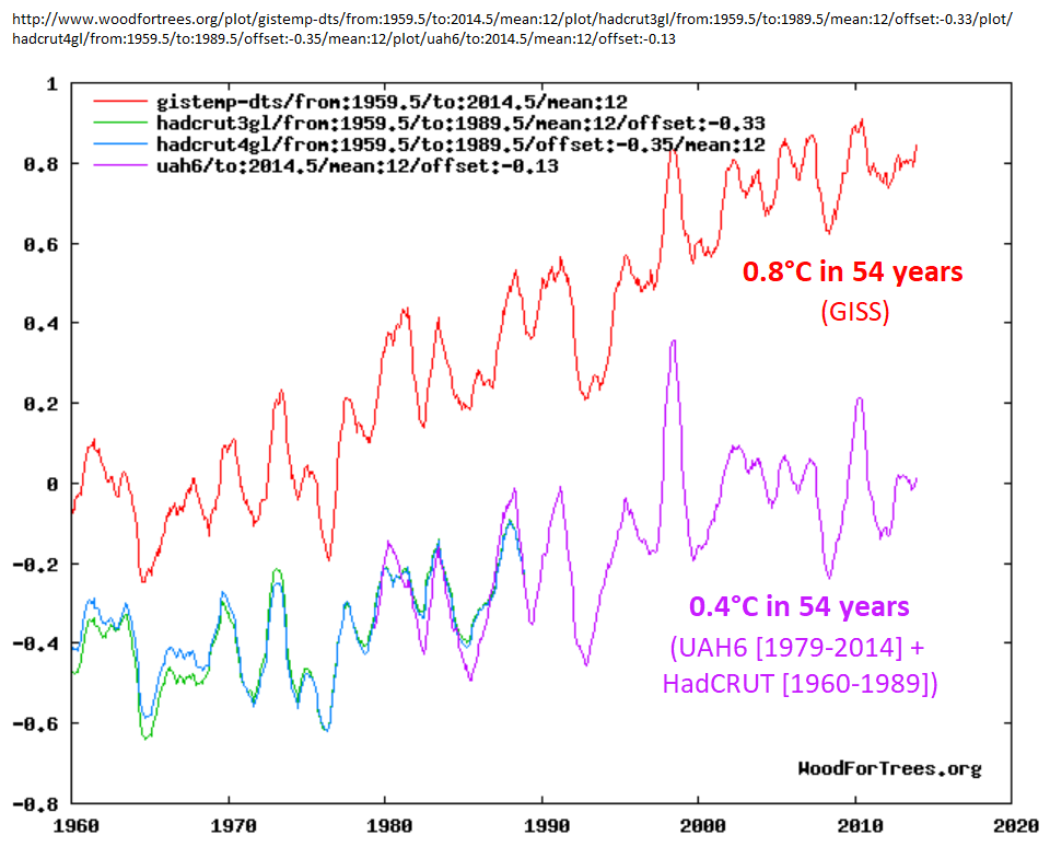
• The first graph shows the temperature indices with highest and lowest rates of warming (GISS and UAH6, respectively). Since the graph starts with 1960, but satellite measurements
didn't begin until 1979, the UAH6 graph is extended back to 1960 with HadCRUT 3 & 4 (plus a decade of overlap).
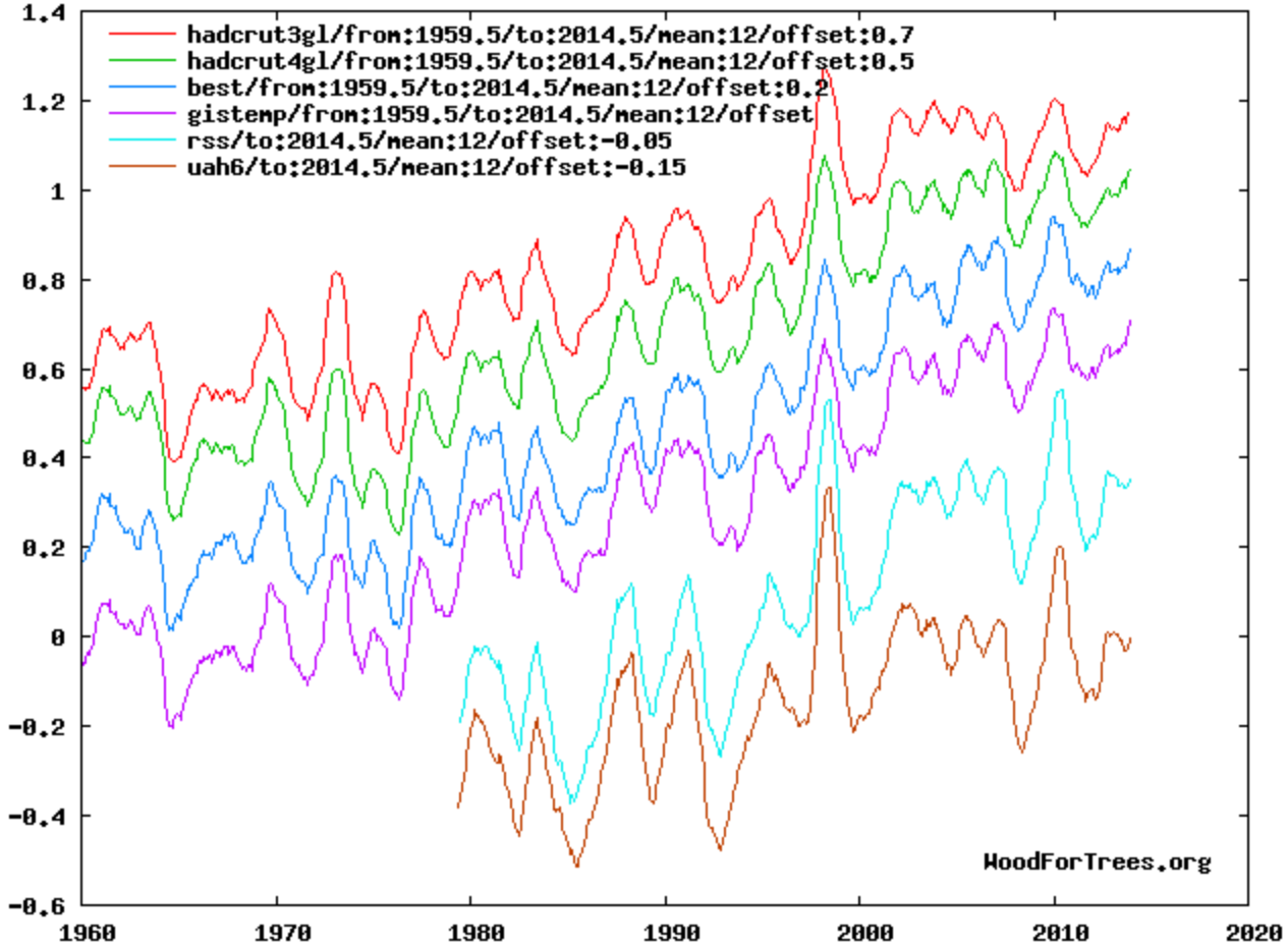
• The second graph shows 6 temperature indices: 4 from surface measurements, and 2 from satellites.
• GISS shows about 0.8 °C of warming from 1960 to 2014.
• UAH6 (extended by HadCRUT) shows about 0.4 °C of warming from 1960 to 2014.

• Click
here (or on the thumbnail) for an
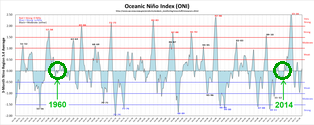
ENSO graph for this period (showing how the 1960 & 2014 starting & ending dates were chosen to avoid major ENSO spikes).
• Click
here to see how the information in these graphs can be used in
climate sensitivity calculations.
• Click
here
to view a combination of the two graphs.
• Click
here
to view a similar graph with only the four surface temperature indices.
• Click either graph to view the original, on Paul Clark's site.
